 Tools
Tools Tools
Tools


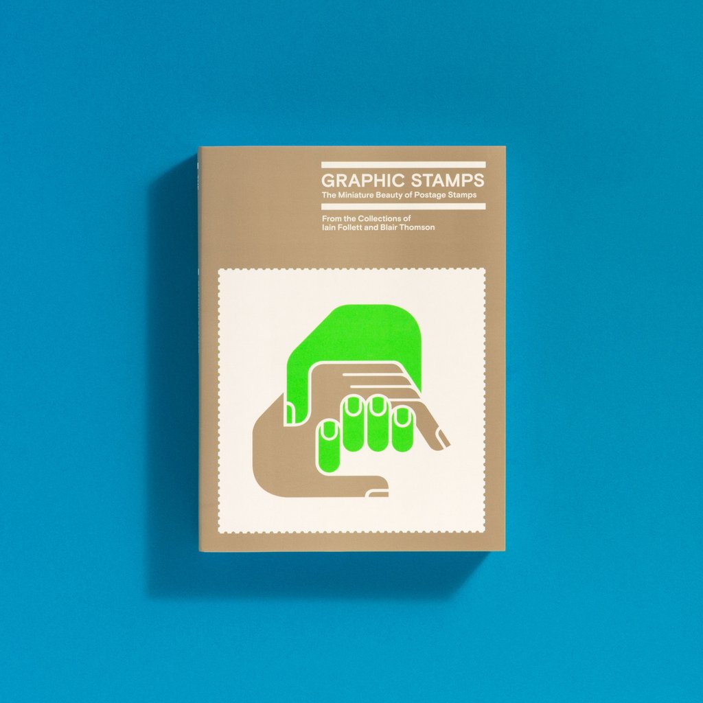
Shaughnessy, Adrian, 2016, Book, The Archive Series #001 Title: Graphic Stamps: The miniature beauty of postage stamps Editor, writer and publisher: Adrian Shaughnessy Unit Editions, London, UK. ISBN 978-0-9932316-4-3
| Abstract or Description: | Graphic Stamps: The miniature beauty of postage stamps, is the first volume in a planned series titled The Archive Series – a bibliographic celebration of graphic design archives and collections. The first title in the new series is devoted to the design of postage stamps. Sourced from the collections of stamp design experts Iain Follett and Blair Thomson, the book celebrates the brilliance of postage stamp design from around the world, and highlights its importance in design practice, especially at a time when ‘the miniature’ is being reappraised in light of the move to mobile phone interface and the miniaturisation of interfaces and icons. The aim of the book is to provide a survey of the design of postage stamps, and to emphasis their importance as specimens of design on a miniature scale. In text and image, the book makes the point that stamps are a neglected field of practice within graphic design. This is paradoxical when we consider the high levels of aesthetic and technical skills required to produce graphics for a tiny scrap of paper with perforated edges. In his seminal book Design in Miniature, David Gentleman – one of the leading stamp designers – explains how designing for a small canvas, rather than being a restraint, can in fact be a springboard to virtuosity. In his view designing for a miniature format ‘forces the artist to be extremely selective and to be quite ruthless in cutting out the essentials. This makes for the characteristic intensity and clarity of design in miniature; compression in space giving the same unity as compression does in the classical theatre.’ The work in this book is a powerful exemplar of Gentleman’s theory: intensity and clarity are exhibited on every page; compression and unity is in abundance. The book also sets out the case for regarding stamp design as a field of practice that encompasses nations not otherwise known for graphic design excellence. Stamps from Venezuela, Mexico and Paraguay are as refined as stamps from Switzerland, Holland and Japan – countries with globally acknowledged reputations for graphic design. It also seeks to establish the idea that a postage stamp does the same job as it did in 1840 when the first stamps were produced. As collected objects, it is their design concerns – to convey information, celebrate events and cultures, to communicate – which mark stamps out as very human creations. In the mid-1970s, David Gentleman voiced the opinion that, as stamps were appearing with such frequency, their curiosity value would inevitably decrease. But this, it seems, only made him, and countless other designers, work even harder. ‘Instead,’ as he concluded in a celebrated talk at the RSA, ‘these small images, packed with so many people’s thought, imagination, and care, have to rely on much more elusive qualities to attract our attention – qualities like interest and beauty. The search for these is surely something that it is worth pursuing.’ |
|---|---|
| Official URL: | http://www.uniteditions.com |
| Subjects: | Creative Arts and Design > W200 Design studies > W210 Graphic Design |
| School or Centre: | School of Communication |
| Date Deposited: | 21 Mar 2017 11:39 |
| Last Modified: | 08 Apr 2026 20:49 |
| URI: | https://researchonline.rca.ac.uk/id/eprint/2760 |
![[img]](https://researchonline.rca.ac.uk/2760/1.haslightboxThumbnailVersion/GRAPHIC_STAMPS_COVER_WEB_01_1024x1024.jpg)
 |
Edit Item (login required) |